


Bold colours are so in at the moment and it looks like they are here to stay. These shades can be very hard to handle when it really comes down to putting a design collected. That’s where we can help, below is a list of our best tips and tricks for handling strong tone in any interior design.
Take into consideration scale
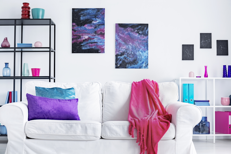
Taking consideration of the proportion and size is a significant factor in designing any room but it becomes particularly vital when you are playing with bold shades. Using too much of one, bright and eye-catching colour in your design causes the risk of feeling overwhelmed rather than a trendy bold style statement. Luckily there is an easy rule to remember if you are working with a small space, go for an accent or feature wall rather than covering the whole room in the bright colour. Whereas with a larger sized room it can handle a punch of colour more so, therefore, will still look trendy. With some accessories tying in the brighter colours to the room will look bold and stylish.
Breaking up patterns using colours and objects
Place something that sparkles in your cushions to break off patterns on your couch and bright coloured throw for a pop of colour on the bed. These objects help tone down the patterned effect and draw the eyes more towards the main design of the room.
Don’t forget your neutrals
When you are working with bold colours neutrals are your secret weapon. These natural colours provide a space for the eye to take a break from all the bold colour. Don’t forget you can add these neutral colours into creative places such as cove around a window if you have a bookshelf the inside of that can be a neutral colour. In a bold room by doing this you will still appreciate the bold colours but also take in the natural lighter colours also.
Add a dose of pattern
Pattern is great to use in interior design. In a room featuring bold colours, you can use it to bring the design together by choosing a pattern that features your shades in a cohesive application. If you are unsure of which bold colours go together picking a unifying pattern is a good place to start building your design. Patterned curtains are extremely important in interior design and can revamp and give a completely different look to a room. As for where to put the patterns you could go for a bold patterned wallpaper and use it as a design/feature wall or you could opt for pillows, rugs, curtains or accessories such as a lamp with a patterned base. A much more subtle option but keeping the patterned theme.
Liven things up a touch
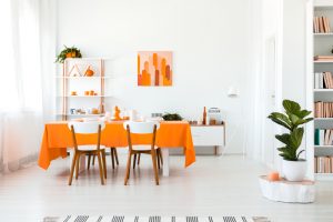
Reds and oranges are powerful and stimulating colours that fill us with energy and motivate us. For rooms with a dull feel about them, you could liven it up a tad by adding a splash of colour with some very traditional drapes that bring fresh and vibrant energy to a space while still not being too overwhelming. Curtains are always a great place to start when adding colour to a room as they can instantly lighten up a space.
Decorating with bold patterns and colours is not everyone’s cup of tea. You sometimes have to be brave and experimental with prints, patterns and bold colours to achieve combinations and contracts that would appeal to your taste and provide aesthetic elegance in the home. If you would like to get in touch, please feel free to give us a call on 0247771 7517.